Evolution of the Fertility, Life Expectancy, and Population in Different Parts of World


Requires a Wolfram Notebook System
Interact on desktop, mobile and cloud with the free Wolfram Player or other Wolfram Language products.
The code contains data on the fertility, life expectancy, and population numbers for 200 countries, as well as for different parts of the world, for groups of more- and less-developed countries, and for the whole world itself, for each year in the time span from 1950 to 2010. This Demonstration not only lets you display the data for these indices for the desired countries or regions, but also track the dynamics of data changes over time.
[more]
Contributed by: Aleksandr Dombrovskiy (June 2015)
Open content licensed under CC BY-NC-SA
Snapshots


Details
This Demonstration was inspired by a lecture by the statistician Hans Rosling [1], where he talks about software development for displaying statistical data. This Demonstration is similar to the graphic in the lecture but with some additional properties, discussed below.
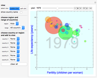
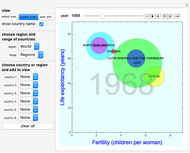
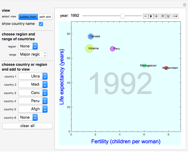
Data on the countries and regions is displayed on the bubble chart, with fertility (the number of children per woman) on the horizontal axis and life expectancy on the vertical axis. The size of the circle indicates the population of the country or region. All the above-mentioned data is available to the public and was taken from the United Nations website [2–4].
The dynamic interface lets you choose one country or region (Snapshot 1), a group of countries (Snapshot 2), a group of regions (Snapshot 3), or the whole world. In Snapshot 4, trajectories of the two neighboring European countries and the two neighboring African countries are displayed, and both the correlations and differences between the neighboring countries of different continents can be clearly seen.
References
[1] H. Rosling. The Best Stats You've Ever Seen. [Video]. (Jun 18, 2015). www.ted.com/talks/hans_rosling_shows _the _best _stats _you _ve _ever _seen #t-676867.
[2] United Nations, Department of Economics and Social Affairs. "Total Population (Both Sexes Combined) by Major Area, Region and Country, Annually for 1950–2100 (Thousands)." World Population Prospects: The 2012 Revision. (Jun 18, 2015) esa.un.org/wpp/Excel-Data/EXCEL_FILES/1_Population/WPP2012_POP_F01 _ 1_TOTAL _POPULATION _BOTH _SEXES.XLS.
[3] United Nations, Department of Economics and Social Affairs. "Total Fertility by Major Area, Region and Country, 1950–2100 (Children per Woman)." World Population Prospects: The 2012 Revision. (Jun 18, 2015) esa.un.org/wpp/Excel-Data/EXCEL_FILES/2_Fertility/WPP2012_FERT_F04 _TOTAL _FERTILITY.XLS.
[4] United Nations, Department of Economics and Social Affairs. "Life Expectancy at Birth (Both Sexes Combined) by Major Area, Region and Country, 1950–2100 (Years)." World Population Prospects: The 2012 Revision. (Jun 18, 2015) esa.un.org/wpp/Excel-Data/EXCEL_FILES/3_Mortality/WPP2012_MORT_F07 _ 1_LIFE _EXPECTANCY _ 0_BOTH _SEXES.XLS.
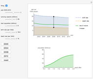 Projected Rates of World Population Increase
Chloe David and Nikki Menis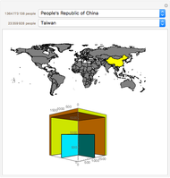 Population Cube
Michael Schreiber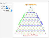 Age Distribution in the World
Christopher Pehl and Sergio Hannibal Mejia (Yokohama International School)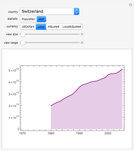 Country Statistics over Time
Alan Joyce Asylum in the United States
Seth J. Chandler and Anne Chandler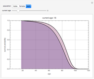 Life Expectancy in the U.S. Population
Jean Buck and Mike Pilat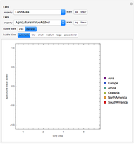 Bubble Chart Comparisons of Countries
Brett Champion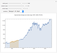 The Dow Jones Industrial Average Since 1928
Chris Boucher Polynomial Fits of Random Walks
Michael Schreiber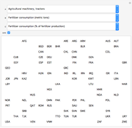 World Bank Data Series Overview
Michael Schreiber