One-Sample t-Test and Confidence Interval with Dot Chart in Small Samples


Requires a Wolfram Notebook System
Interact on desktop, mobile and cloud with the free Wolfram Player or other Wolfram Language products.
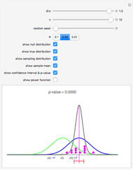
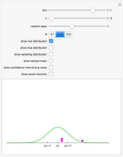
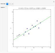
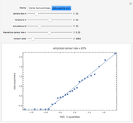
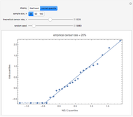
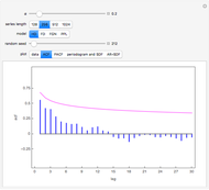
The dot chart represents a random sample of size  from a normal distribution, shown in blue, with mean
  and standard deviation
  . This is the true distribution. This Demonstration focuses on the null hypothesis,
 . For hypothesis testing, it is assumed that the sample is from a normal population with unknown mean and unknown variance. The hypothetical distribution,
  , is shown in green. When
  , the null distribution and true distribution are the same, but otherwise they are different.


Contributed by: Douglas Woolford and Ian McLeod (August 2011)
Open content licensed under CC BY-NC-SA
Snapshots

Details
We focus on small samples,  to avoid resizing and thus distorting the graphic, which is an important consideration for dynamic plots.
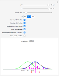
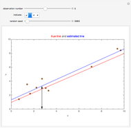
Snapshot 1: A new sample with  instead of . The width of the confidence interval is slightly larger than in the thumbnail as might be expected. But click the "random seed" slider "+" button and then click the play button to see there is considerable variation in the size of the confidence interval. This is because the t-test is used. If a
  test were used, the width of the confidence interval would only depend on
  and
and  and not on the actual data.
Snapshot 2: Same setting as snapshot 1 but a new sample. Notice the sampling distribution has changed and is not quite so centered over the true distribution. In this case, the confidence interval is actually wider than snapshot 1 and even wider than the case when . This is due to randomness.
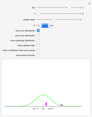
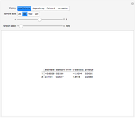
Snapshot 3: This scenario provides a teaching simulation. The instructor might say, "I think the average height of men in this class is about 5.5 feet". The null distribution with  is shown. The dot chart shows the results of a simulated sample of size 3. In this case, all the observations are greater than
  .
.
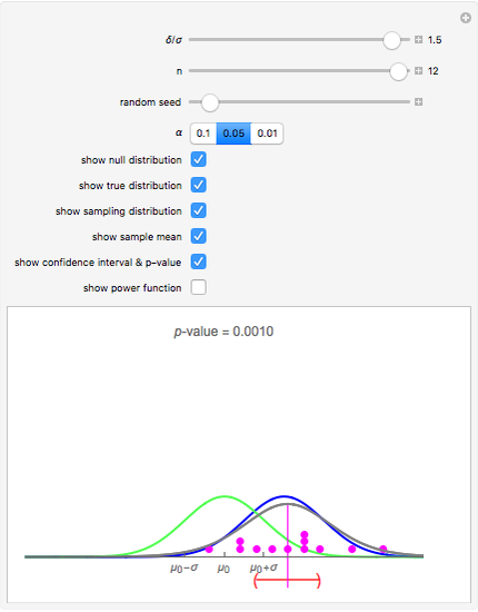
Snapshot 4: The 95% confidence and the  -value are now shown. The 95% confidence interval includes and the -value is 0.1888 so there is evidence against finding
  could easily be due to chance. We have used a two-sided test, which is more conservative than one-sided alternatives. In general, as recommended in [1] §1.8, one-sided tests may, in actual practice, too easily result in spurious findings and so are not recommended.
Snapshot 5: Increasing the size of sample to  provides strong evidence that is not true.
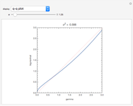
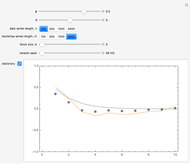
Snapshot 6: Let  and
and  denote the probability of a type II error and power, respectively. The power curve, versus
  , for the two-sample t-test when and
  is shown. By symmetry, the curve is only shown for
  . Green is used to indicate the power at the set value of
  , in this case
  . In planned experiments, usually a minimum power of 90% is desired and the green lines indicate the size of needed to attain 90% power. So from the plot we see that ,
  and that to achieve 90% we would need
  . Another way 90% could be achieved is by increasing the sample size . Slide up to 12 and you see that we can attain about 90% with . The computation of power in the one-sample t-test is discussed in many textbooks (see also Noncentral t-distribution). To exit the power curve display, uncheck the checkbox.
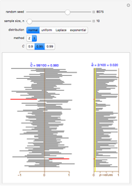
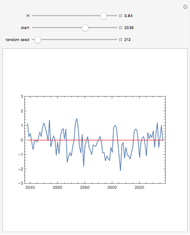
Snapshot 7: When is selected, we can explore how the t-test behaves when the null hypothesis is true. In this case the -value is uniformly distributed between 0 and 1. When the "random seed" slider is changed, fresh -values and confidence intervals are generated. If is increased, the -values are still random but tend to be smaller reflecting the fact that becomes less tenable.
Snapshot 8: Similar to snapshot 7, but we just show the true distribution and the sampling distribution and ignore the hypothesis testing.
Many other scenarios that offer illuminating insights may be obtained by experimenting with other settings.
Reference
[1] G. van Belle, Statistical Rules of Thumb, 2nd ed., New York: Wiley, 2008.
Permanent Citation
 Robustness of Student t in the One-Sample Problem
Ian McLeod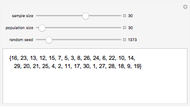 Random Samples and Random Permutations
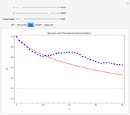
Ian McLeod Estimating and Diagnostic Checking in Censored Normal Random Samples
Nagham Muslim Mohammad and Ian McLeod Sampling Distribution of the Mean and Standard Deviation in Various Populations
Ian McLeod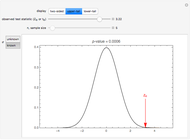 The p-Value in One-Sample Tests for the Mean
Ian McLeod Simultaneous Confidence Interval for the Weibull Parameters
Michail Bozoudis Impact of Sample Size on Approximating the Uniform Distribution
Paul Savory (University of Nebraska-Lincoln)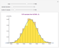 Impact of Sample Size on Approximating the Normal Distribution
Paul Savory (University of Nebraska-Lincoln) Impact of Sample Size on Approximating the Triangular Distribution
Paul Savory (University of Nebraska-Lincoln) Calculating Sample Size
Daniel de Souza Carvalho
-
 Rank Transform in Harmonic Regression Time Series
Ian McLeod -
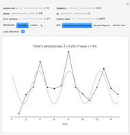 Detecting Periodicity in Short Time Series
Ian McLeod -
 Tempered Fractionally Differenced White Noise
Ian McLeod -
 Regression toward the Mean
Ian McLeod -
 Spread-Location Regression Diagnostic Check
Ian McLeod -
 Anscombe Quartet
Ian McLeod -
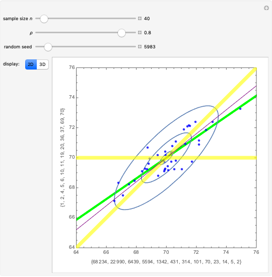
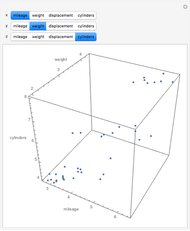 Visualizing Higher-Dimensional Data with 3D Scatterplots
Ian McLeod -
 Mean, Fitted-Value, Error, and Residual in Simple Linear Regression
Ian McLeod -
Estimating and Diagnostic Checking in Censored Normal Random Samples
Ian McLeod -
 Comparing Gamma and Log-Normal Distributions
Ian McLeod -
 Monte Carlo Expectation-Maximization (EM) Algorithm
Ian McLeod -
 Comparing Exact and Approximate Censored Normal Likelihoods
Ian McLeod -
 Transformation to Symmetry of Gamma Random Variables
Ian McLeod -
 Illustrating the Central Limit Theorem with Sums of Bernoulli Random Variables
Ian McLeod -
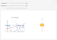
 Hidden Correlation in Regression
Ian McLeod -
 Informal Power Assessment of the Normal Probability Plot
Ian McLeod -
 Time Series for Power-Law Decay
Ian McLeod -
 Block Bootstrap for Time Series
Ian McLeod -
 Fractional Gaussian Noise
Ian McLeod -
 Plotting a Long Time Series
Ian McLeod