How Receiver Operating Characteristic Curves Work


Requires a Wolfram Notebook System
Interact on desktop, mobile and cloud with the free Wolfram Player or other Wolfram Language products.
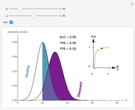
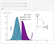
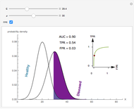
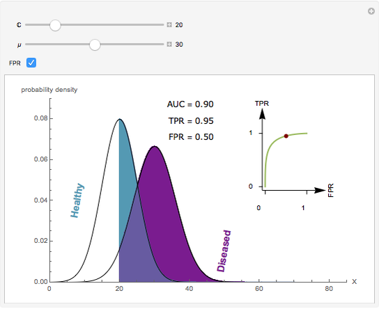
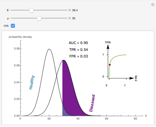
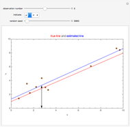
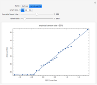
Visually the ROC curve, shown in the top-right corner, is the shaded area under the right curve versus the shaded area under the left curve as the threshold parameter  varies. A more detailed explanation now follows.


Contributed by: Ian McLeod (March 2011)
Open content licensed under CC BY-NC-SA
Snapshots

Details
Denote the cumulative distribution functions of  in the healthy and diseased populations by
  and
and  . Then the tail functions are respectively
  ,
,  . It may be shown that
  ,
,  and
and
 .
.
An explicit closed-form formula for AUC in the case of binormal populations is given in [1], p. 34.
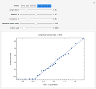
The AUC can be interpreted as the probability that a randomly chosen member from the diseased population will have a higher  than a randomly chosen member from the healthy population.
An interesting example of the use of ROC curves to compare classifiers is given in [2], figure 9.6, p. 316. See also the Demonstration "Uncertainty of Measurement and Diagnostic Accuracy Measures" for an illustration of the use of ROC to compare two diagnostic tests. In practice, ROC curves are often used to compare a number of diagnostic tests or classifiers.
The glaucoma example discussed in this Demonstration is presented in [4] and there are many similar examples in the references below. Two in-depth treatments of ROC curves are provided in [1] and [3].
[1] W. J. Krzanowski and D. J. Hand, ROC Curves for Continuous Data, CRC/Chapman & Hall, 2009.
[2] T. Hastie, R. Tibshirani, and J. Friedman, The Elements of Statistical Learning: Data Mining, Inference, and Prediction, 2nd ed., New York: Springer, 2009.
[3] M.S. Pepe, The Statistical Evaluation of Medical Tests for Classification and Prediction, New York: Oxford, 2003.
[4] J. A. Swets, R. M. Dawes, and J. Monahan, "Better Decisions through Science," Scientific American, 283, 2000 pp. 82–87.
Permanent Citation
 Receiver Operating Characteristic Curves and Uncertainty of Measurement
Aristides T. Hatjimihail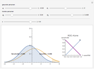 Receiver Operating Characteristic (ROC) Kurve bei Quantitativen Diagnosetests (German)
Stefan Englert Uncertainty of Measurement and Areas Over and Under the ROC Curves
Aristides T. Hatjimihail (Hellenic Complex Systems Laboratory) Sigmoid Microbial Survival Curves
Mark D. Normand and Micha Peleg Analysis of Diagnostic Accuracy Measures
Theodora Chatzimichail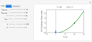 Square Root Model for Rates of Microbial Growth or Inactivation
Mark D. Normand and Micha Peleg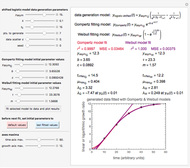 Lag Time in Microbial Growth
Mark D. Normand and Micha Peleg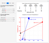 Comparing Ambiguous Inferences when Probabilities Are Imprecise
John Fountain and Philip Gunby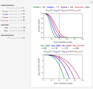 Degrees of Microbial Injury and Survival
Mark D. Normand and Micha Peleg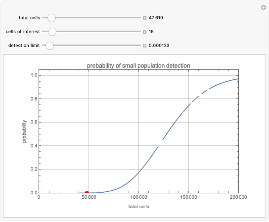 Rare Event Analysis by Flow Cytometry
David T. Miller
-
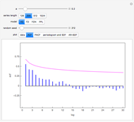
 Rank Transform in Harmonic Regression Time Series
Ian McLeod -
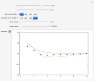
 Detecting Periodicity in Short Time Series
Ian McLeod -
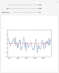
 Tempered Fractionally Differenced White Noise
Ian McLeod -
 Regression toward the Mean
Ian McLeod -
 Spread-Location Regression Diagnostic Check
Ian McLeod -
 Anscombe Quartet
Ian McLeod -
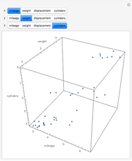 Visualizing Higher-Dimensional Data with 3D Scatterplots
Ian McLeod -
 Mean, Fitted-Value, Error, and Residual in Simple Linear Regression
Ian McLeod -
 Estimating and Diagnostic Checking in Censored Normal Random Samples
Ian McLeod -
 Comparing Gamma and Log-Normal Distributions
Ian McLeod -
 Monte Carlo Expectation-Maximization (EM) Algorithm
Ian McLeod -
 Comparing Exact and Approximate Censored Normal Likelihoods
Ian McLeod -
 Transformation to Symmetry of Gamma Random Variables
Ian McLeod -
 Illustrating the Central Limit Theorem with Sums of Bernoulli Random Variables
Ian McLeod -
 Hidden Correlation in Regression
Ian McLeod -
 Informal Power Assessment of the Normal Probability Plot
Ian McLeod -
 Time Series for Power-Law Decay
Ian McLeod -
 Block Bootstrap for Time Series
Ian McLeod -
 Fractional Gaussian Noise
Ian McLeod -
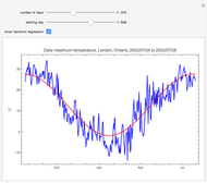 Plotting a Long Time Series
Ian McLeod